What is website design?
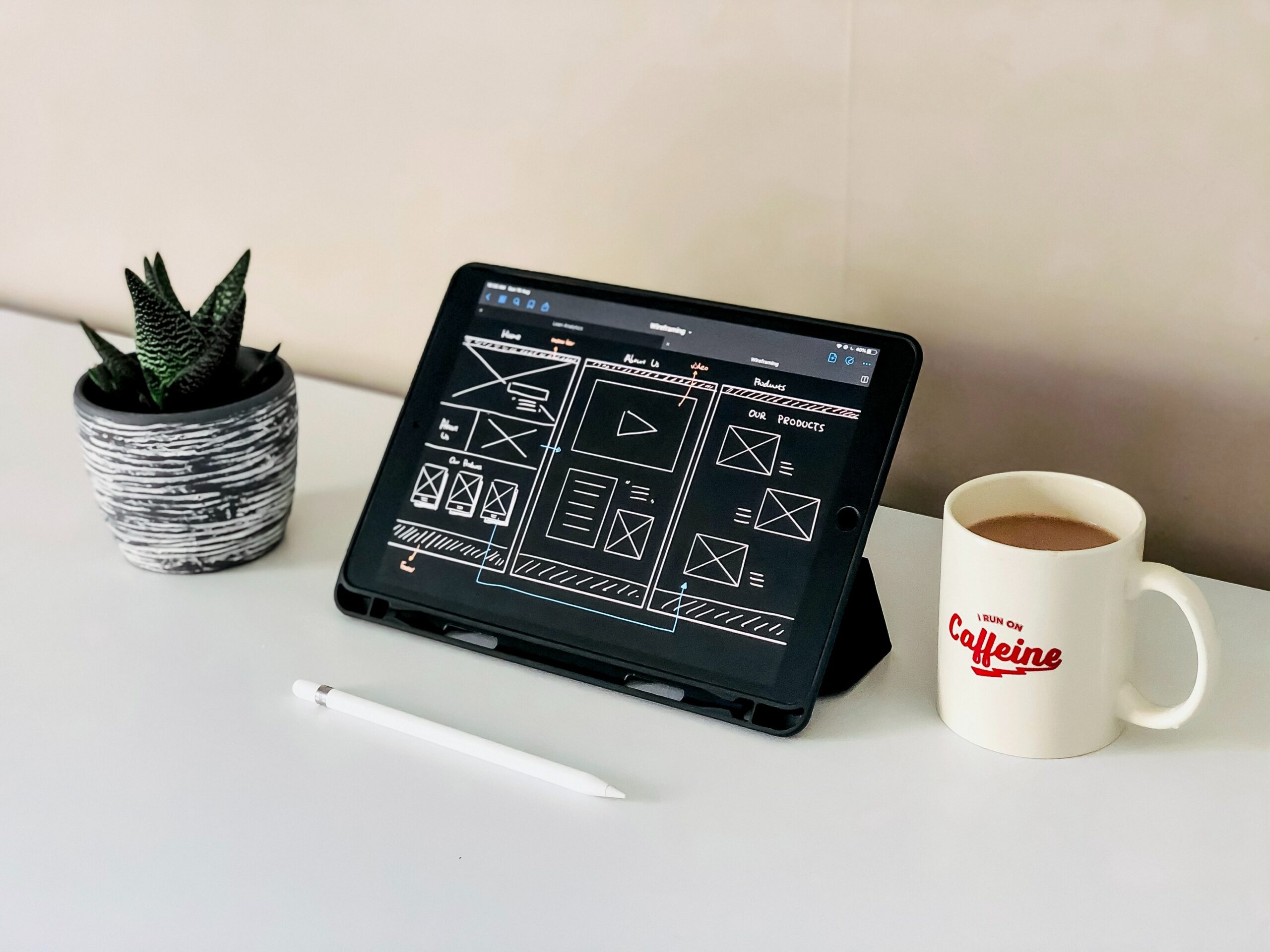
Website design layout in simple terms is the pattern or structure in which the content of the website is laid out. It is very important to select the right layout when developing a website as the design of the website plays an important role in providing a pleasant experience
Table of Contents
1. The F Layout Design
The F-Pattern is the layout that is based upon the common human behavior the way most people read which is from left to right. The web design can use the layout to build the page which is suitable for reading and also it is a natural expectation for the user to find the most important data. The user will typically scan the page in an F-pattern and we can use it to place the most important information or the actions we want the user to perform
2. The Zig-Zag Layout Design
The Zig-Zag pattern is the layout commonly used design to display the content in a Z letter fashion this layout is based upon the user’s behavior of how their eyes move in a Z letter direction
- First, eye goes from left to right
- Next, eye goes down and to the left
- Last, their eyes move back across to the right again
Such type of design layout can be used in a wide range of website the two popular layout for the Zig-Zag layout is the Aligned Layout and the Alternating layout.
Aligned Layout is the traditional pattern in which the row are under one other with all the images on either left or right side and the text on the other
Alternating Layout has been recently popularized in this layout the images and text are placed alternately in each row to break the boring monotony among the users
3. The Grid Layout Design
The Grid Layout is a simple layout where the information is organized into grids. where each block in the grid can contain content of specific height and length. the grid design lets the users easily find the information in each block the most popular use of this design layout is youtube.com. It is one of the most commonly used layout design as it simple to implement looks neat and removes the guesswork for both the user and the developer
4. The Asymmetrical Layout Design
The Asymmetrical Layout design can be explained as the layout with unexpected positioning opposite to traditional website design where everything is aligned and has an expected start and end. Asymmetrical design when implemented properly can be very appealing due to its rebellious nature towards other layout designs. It gives the users a unique perspective and makes them realize that things can be viewed differently. Asymmetrical design can catch the attention of the user how every bad implementation can quickly put off the user. It is also useful to use this design when the content of the page is not predetermined and may change over a period of time.
5. The Featured Image Layout
In this layout, the idea is to use a large image to focus the users’ attention on the important content and make the first impression to be spectacular. It builds a unique connection with the user and keeps them hooked. Using is a high-quality graphic is a must as a low-resolution blurry image will quickly put off the user. Along with the graphic, some text with large and bold font can make your website design look very beautiful. Such a layout can be used on the website where you want to create an immersive and emotional experience and have only one product/service you want to sell. It is a great way to promote the goods or services at a glance


